Author: Rubi Garyfalakis Art as Therapy
March is typically the time of year when we Canadians start woefully resenting winter and wishing desperately for spring. For many, the monotonous landscape of white and gray begins to take its toll on both mood and energy. We dread hearing snow in the forecast and grumble about shovelling the driveway again. But in reality, spring is still some time away. That’s why at Art as Therapy we are thinking about infusing the monotony of winter with some COLOUR!
Color psychology explores the mental, emotional, and behavioral effects of color. Everyone sees and interprets color differently, making color psychology quite subjective. However, there are some commonly accepted effects associated with various colors. For example, warm colors like red and orange are considered to be energizing because they tend to increase heart rate and adrenaline. Cool colours like blue and green have the opposite physiological effect – viewing these colors tends to reduce heart rate and encourage slower breathing – so they are considered calming colours. There is also a general acceptance that color is associated with mood. We even use colours to describe mood, like when we say that someone is “feeling blue,” or perhaps “green with envy,” or even “seeing red.” We tend to use different colors to express emotions – yellow is often associated with happiness, while blue is associated with sadness and red is associated with anger or passion. For a chart of common color associations, check out the link below: http://www.arttherapyblog.com/color-meanings-and-color-symbolism-chart.html
Given these common associations, as well as personal associations based on culture, experience, and memories, there is little doubt that colors and emotions are connected. At Art as Therapy, we’re wondering if we can use color to influence mood – more specifically, to cheer us up from the monotony of winter. If we associate certain colors with energy and positive emotions, then it seems plausible that surrounding ourselves with those colours will increase our chances of actually experiencing more energy and positive emotions.
Fashion writer Liana Satenstein found this to be true when she tried wearing brightly coloured clothes for a week instead of her usual black and gray wardrobe. She found that bringing colour into her outfits made her feel more creative, more outgoing, and increased her confidence at work. To read more about Liana’s fashion experiment, visit http://www.vogue.com/2161965/can-wearing-bright-colors-improve-mood/.
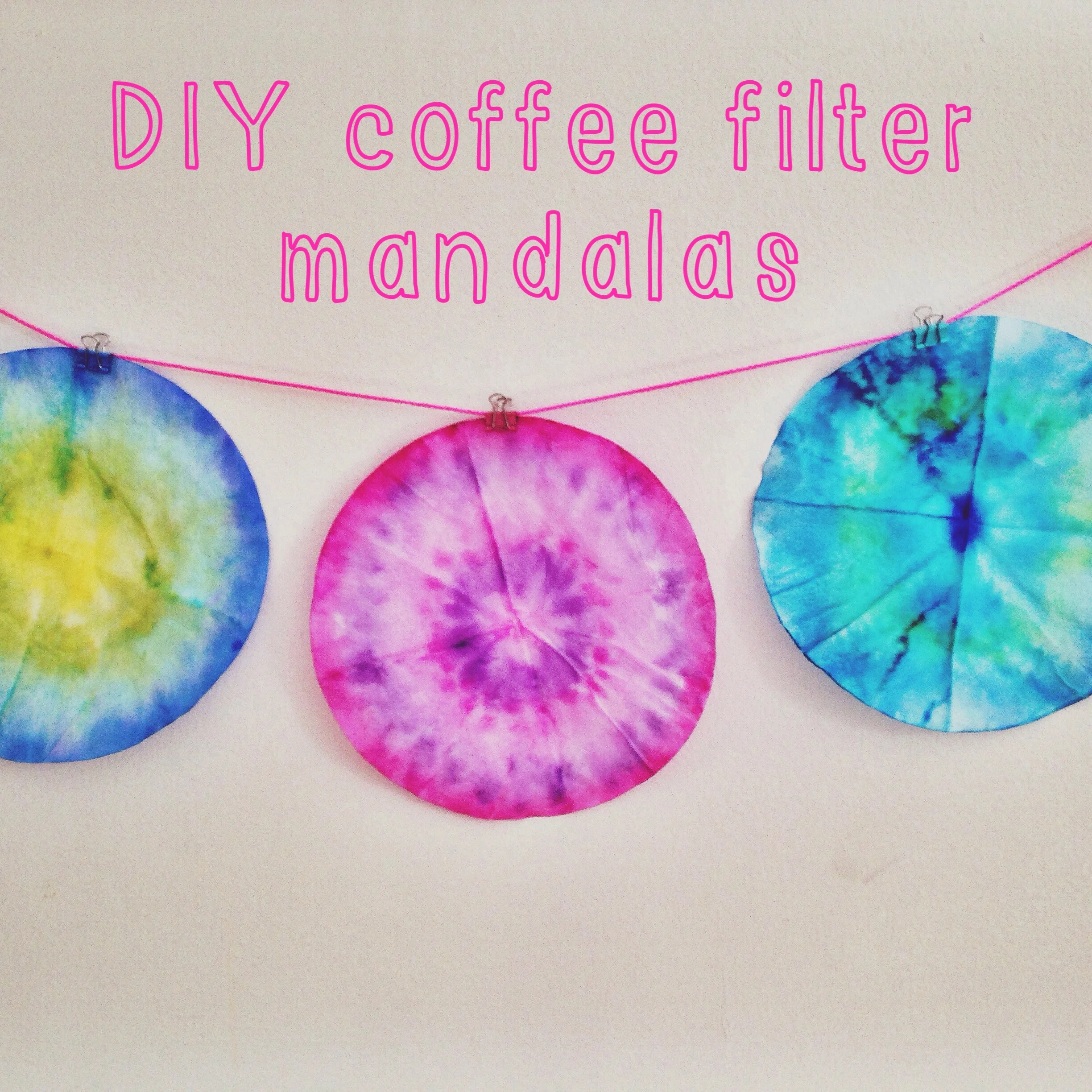
Wearing a yellow scarf, an orange hat, or a green sweater sounds like an excellent start to kicking the winter blues. Another strategy is to try a simple art activity like a coffee filter mandala. In art therapy, we often refer to art created within a circle as a mandala, a Sanskrit word meaning “sacred circle.” Mandalas are used in Eastern cultures as a form of visual meditation. More broadly, circular forms are often associated with the universe, infinity, wholeness, birth, or the emergence of something new. Creating art within a circle form can help us to feel more centred and focused. If you are feeling lost in the monotony of winter, a centering art strategy might be just the thing you need to re-energize and to invite colour back into your routine.
This project will only take about 10 minutes – the time it takes to brew another pot of coffee. Your coffee filter artwork will infuse your space with creativity and colour, and might just boost your mood too. To make your own coffee filter mandala, all you need is a basket-type coffee filter, some washable markers (Crayola works great!), and a spray bottle for water. First, draw on your coffee filter using the markers. Choose bright, bold colors that have positive associations for you. The colors will blend together when you add water, so you might like the effect of using analogous colours (eg. red, orange, yellow / light blue, light green, yellow / purple, pink, red). You can block in large areas of colour, or try creating a design starting from the centre of the filter and working out towards the edges. Once you have completed your design, place your coffee filter on a piece of blank white paper to protect your drawing surface. Then, spray your mandala with water using a spray bottle to create a watercolor effect. Watch as the colors blend and mix together as if they’re dancing in the first spring rain.
After your coffee filter dries, you will have a colorful, translucent mandala that you can hang in your window or on your wall. It’s so quick and easy, why not make a few while you’re at it? Surrounding yourself with creativity and colour is a great strategy to boost your mood on a dreary winter day, and will also serve as a reminder that spring is on its way!
References:
Malchiodi, C. (2007). The Art Therapy Sourcebook. New York: McGraw-Hill.
http://rachelmims.blogspot.ca/2013/02/coffee-filter-art-projects.html
http://www.arttherapyblog.com/color-meanings-and-color-symbolism-chart.html
http://elementaryartfun.blogspot.ca/2013/05/best-project-ever.html